
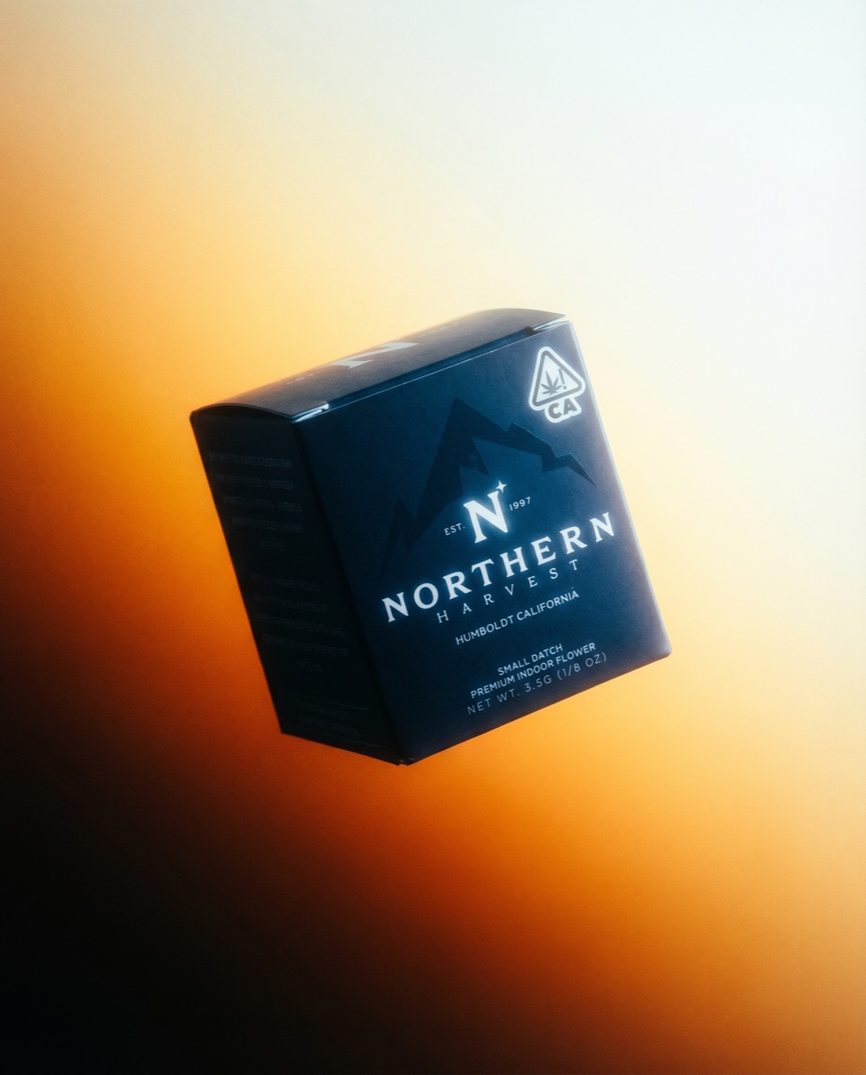
Northern Harvest 8th Box
Packaging · Northern Harvest
Northern Harvest is a Humboldt County cannabis house, est. 1997, built on indoor flower and farmed by the same family for three decades. In a category that brands itself loud, the house had real heritage and no visual language to carry it: closer in spirit to a heritage spirits label than to anything else in the case.
Northern Harvest had three decades of growing behind it and a flagship package that did not say so. The 3.5g box leads the line: whatever it established, every other package would inherit, and the dispensary shelf it competes on shouts in green and gold. Brought in as lead designer to own the box end to end, structure through print, and to set the standard the rest of the packaging would follow.
The answer was restraint, engineered rather than styled. Drew the structure first, a true cube with every face near equal, so the box reads as an object before it reads as packaging. Held the surface to one color of ink and pushed the mountain tone-on-tone, so the brand whispers at shelf distance and rewards the close look. Folded the compliance layer into the grid so mandated text sits like typography instead of regulation. The reference point was a heritage spirits label, not the cannabis aisle, and the box wins the glass case by being the one quiet object in it.
Matte navy board, printed direct, no adhesive labels. Mountain range runs tone-on-tone behind the mark. All type reversed in white, serif caps over script. Left panel holds the brand story in running text, not bullet claims. CA universal symbol set into the grid, not stuck on after. Dieline minimizes cuts for a cleaner profile.