Northern Harvest Logo
Logo Design · Northern Harvest
Northern Harvest is a Humboldt County cannabis house, est. 1997, built on indoor flower and farmed by the same family for three decades. In a category that brands itself loud, the house had real heritage and no visual language to carry it: closer in spirit to a heritage spirits label than to anything else in the case.
The house predates the brand: a family growing in Humboldt since 1997 with no marks to show for it. The identity had to be drawn before any package, menu, or site could exist, and it had to hold on a box, an app icon, and a building without changing character. The assignment was the full mark system and the rules for living with it.
Drew the marks so the heritage is in the construction, not a tagline: the serif carries the decades, the script carries the family hand, and the founding year is built into the monogram itself. Treated the mountain as background texture rather than a competing badge, so the marks layer on one surface without fighting. Then set the rules: when each mark appears, at what size, and in how many colors, which is one. Tested everything where identities actually fail, at thumbnail scale and on curved printed surfaces, before approving any of it for production.
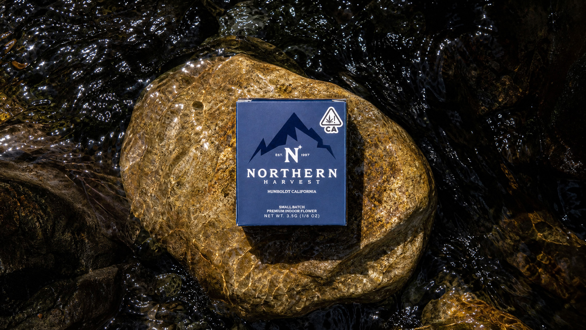
N+ monogram with EST. 1997 split across the mark. Star detail set off the right shoulder of the N. Serif caps over script Harvest in a single lockup. Mountain silhouette drawn from the Trinity Range. Holds in one color, white on navy, from app icon to signage.