
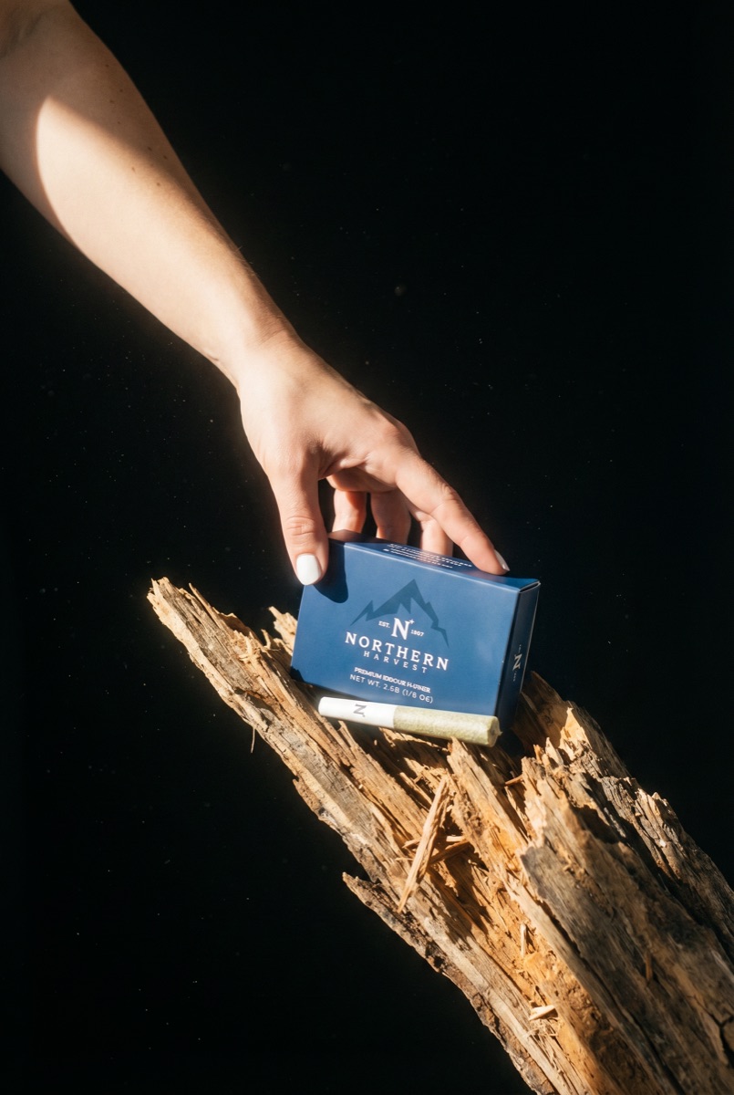
Northern Harvest Pre-rolls
Packaging · Northern Harvest
Northern Harvest is a Humboldt County cannabis house, est. 1997, built on indoor flower and farmed by the same family for three decades. In a category that brands itself loud, the house had real heritage and no visual language to carry it: closer in spirit to a heritage spirits label than to anything else in the case.
With the flagship box set, the 10-count minis were the first test of whether the system could travel. A ten-pack lives a different life: lower price point, faster purchase, a horizontal slot in the case instead of a standing one. The brief was to carry the brand down in size and price without letting it slip downmarket.
Chose a slide-through sleeve and tray over a hinged lid, because a sleeve opens like a gift and a hinge opens like a cigarette pack, and this brand is not a cigarette pack. Set the box landscape so it owns its long edge in the case, carried the flower box type system down without shrinking it into noise, and specced the cones themselves so the mark survives on the smallest printed surface in the line. Wrote the disclosure copy as a sentence rather than a warning, so even the mandated text speaks in the brand's voice.
Slide-through sleeve and tray, no hinge, no thumb notch. Ten 0.35g cones, N+ printed at the filter of each. Top panel reads in full: this box contains ten cannabis rolls. Short side panels carry the monogram so the box ranks from any angle. Same navy board and white-only print spec as the flagship.