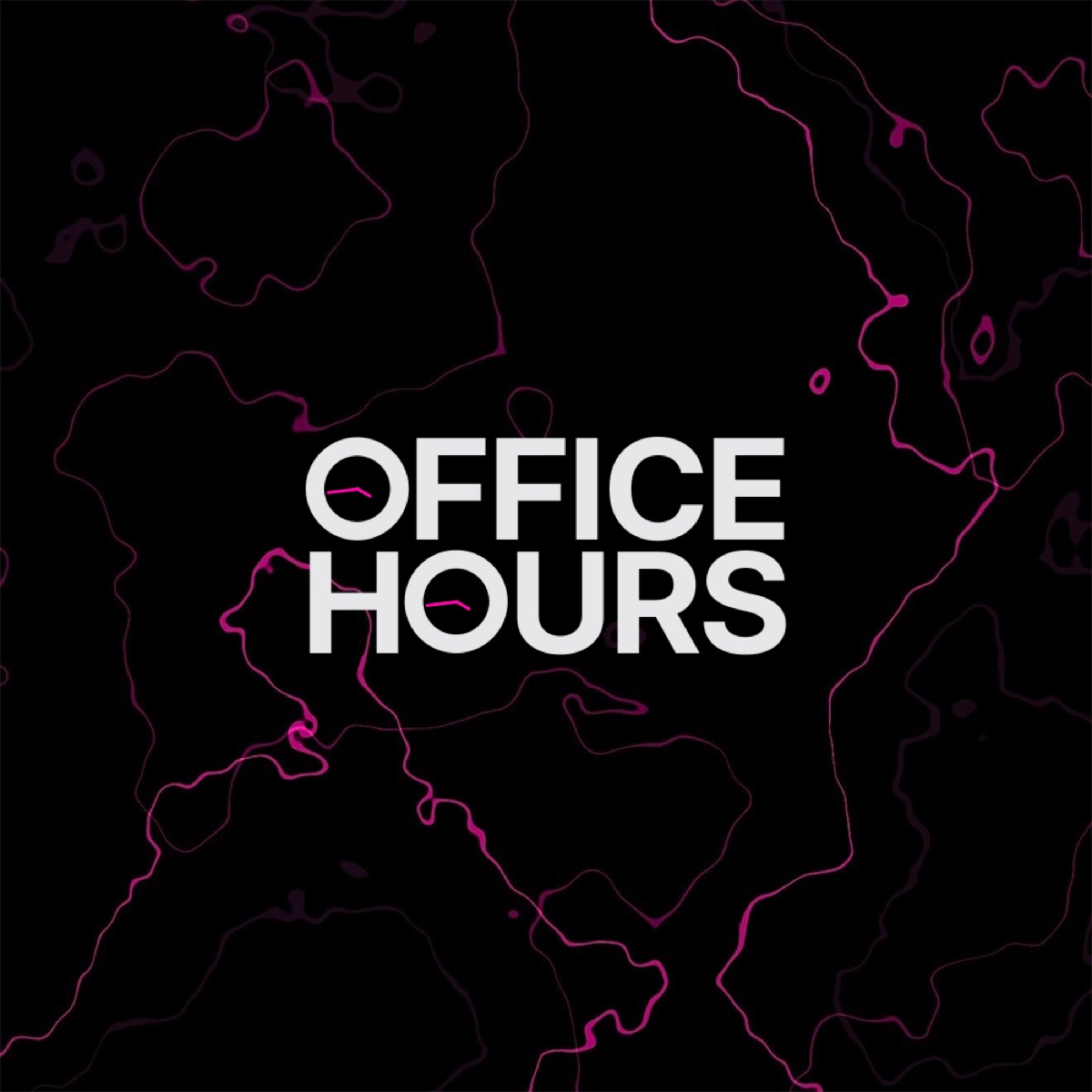
Office Hours Logo
Logo Design · Office Hours
Office Hours is an iOS product for peer learning. It pairs mentors and students in booked sessions and replaces the long scheduling thread with one screen. The product's whole premise is removing friction between two people who already want to talk.
Office Hours needed a mark that would live its whole life between 29 and 60 pixels, surrounded by the loudest icons on a phone. Most identities are drawn big and shrunk until they smear. The assignment was the opposite discipline.
Drew the app mark at icon scale first and enlarged second: one weight, one color, no counters that close up small, nothing that blurs at a glance. Extended the same construction into the wordmark so the two never read as cousins from different families, then locked the rules for where each appears. The result sits calm on a home screen precisely because everything around it is shouting.
Drawn at icon scale first, enlarged second. Holds in one color and one weight. Wordmark and app mark share construction, not decoration. No gradients, no detail that dies under 60 pixels.